
Mwima Concept
- Brand Naming and Strategy Development
- Logo and Visual Identity Design
- Color Palette and Typography Development
- Art Direction and Brand Guidelines
Brand Essence
Mwima’s essence lies in its celebration of Algerian craftsmanship, with every product telling a story of tradition, passion, and artistry. The goal was to create a brand identity that felt both grounded in heritage and refreshed for modern audiences.
Naming and Concept Development
The name “Mwima”, meaning "the mother" in the Setifian dialect, embodies heritage, creation, and a deep reverence for Algerian culture and roots, especially since the brand's tone of voice is oriented towards the local Algerian dialect. This subtle yet powerful reference reflects the brand’s divine and protective qualities.
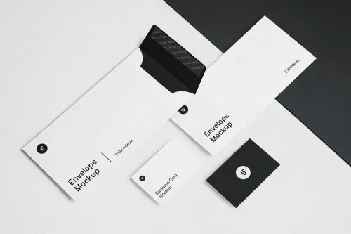
Visual Identity
Logo: At the heart of Mwima’s identity is the Amazigh symbol of the Grain, a motif representing seeds of knowledge and creativity. The logotype, characterized by its linear yet imperfect details, mirrors the intricate craftsmanship found in Algerian woodcarving, pottery, and textiles. This approach honors traditional artisans while maintaining a contemporary edge.
Colors: A palette of earthy, muted tones was chosen to evoke a sense of calm, authenticity, and ethnic identity.
Typography: Minimalistic and clean, allowing the craftsmanship to take center stage without distraction. This balance between simplicity and richness reflects Mwima’s essence.
Visual Style and Brand Imagery
Modern graphic elements intertwine with curated photography, highlighting artistry, Algerian culture, and educational content. This visual blend creates a sophisticated yet approachable aesthetic that appeals to diverse audiences.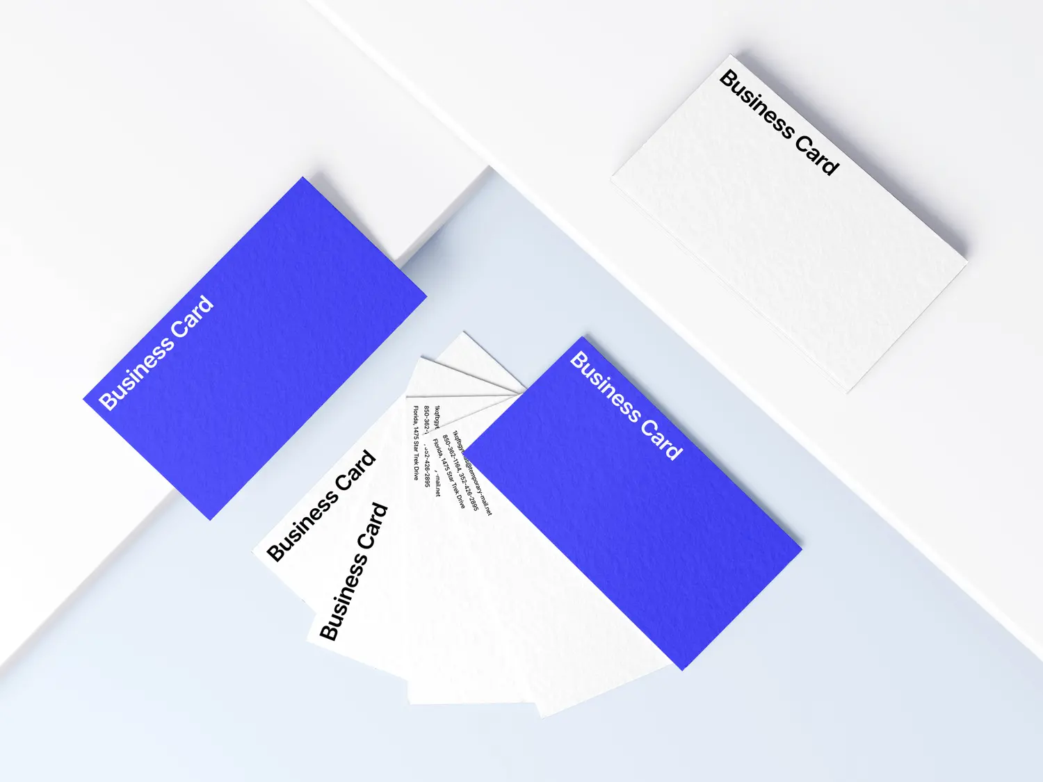
- Successfully established Mwima as a recognized brand in the Algerian artisanal space.
- Enhanced social media engagement through culturally immersive visual storytelling.
- Strengthened the connection between Algerian youth and traditional craftsmanship by creating a brand that feels relevant and aspirational.
- Positioned Mwima as a key driver of economic growth for local artisans through ethical and sustainable partnerships.
Mwima stands as a testament to how design can preserve heritage while shaping the future. This project was not just about creating visuals but fostering a renewed appreciation for Algerian craftsmanship.
 Contact
.svg) Connect
Connect